데이터 시각화
가장 간단한 데이터 시각화 방법은 6장에서 살펴본 plot( )을 이용하는 것이다. plot( )은 데이터를 크게 신경 쓰지 않고 넘겨주어도 자동으로 적절한 형태의 그래프를 찾아서 그려준다. 두 번째로 사용할 만한 함수는 caret::featurePlot( )이다.
|
caret::featurePlot : 예측 변수(피처)와 분류 간의 그래프를 그린다. |
caret::featurePlot( x, # 행렬 또는 데이터 프레임 y, # 분류를 뜻하는 팩터 # 그래프의 종류 : 상자(box), 줄무늬(strip), 밀도(density), 산점도(pairs), 타원(ellipse) plot=if(is.factor(y)) "strip" else "scatter" ) |
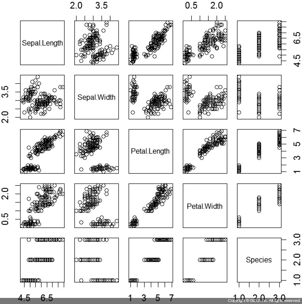
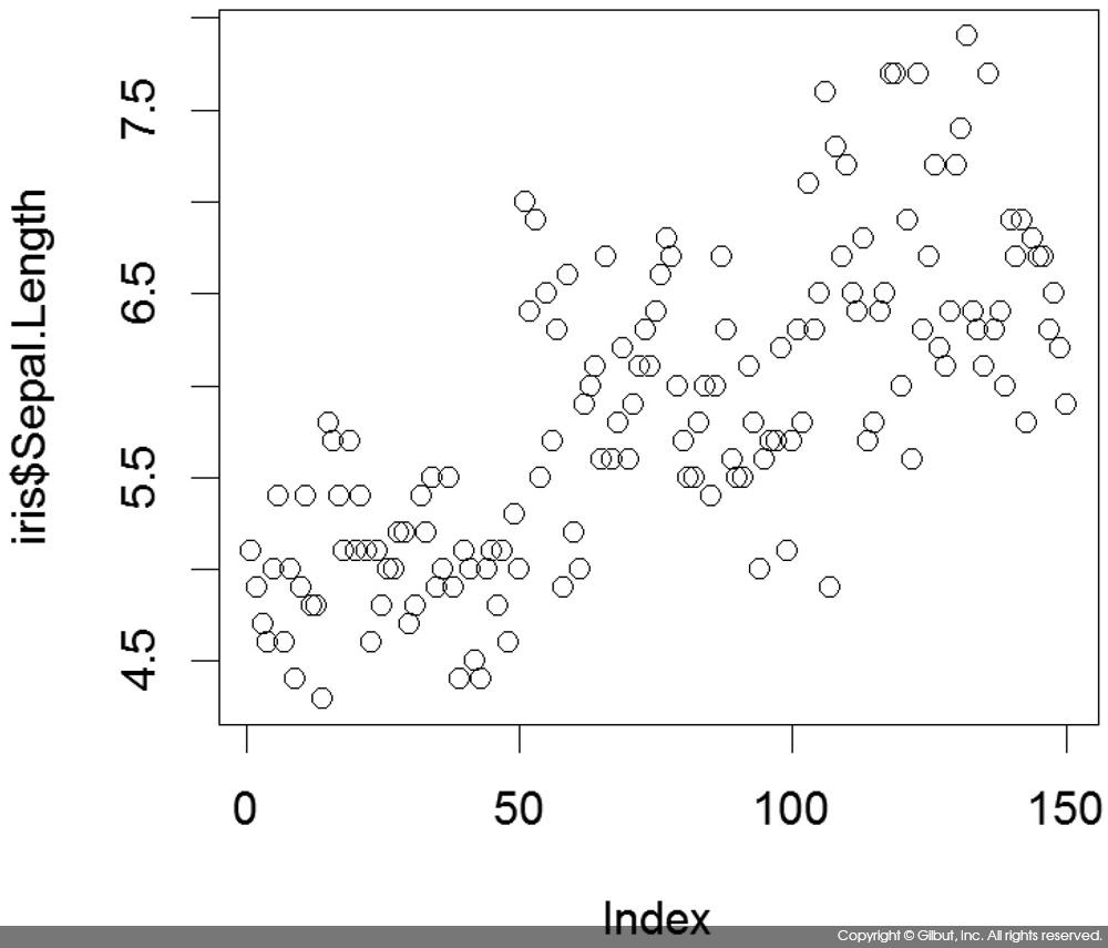
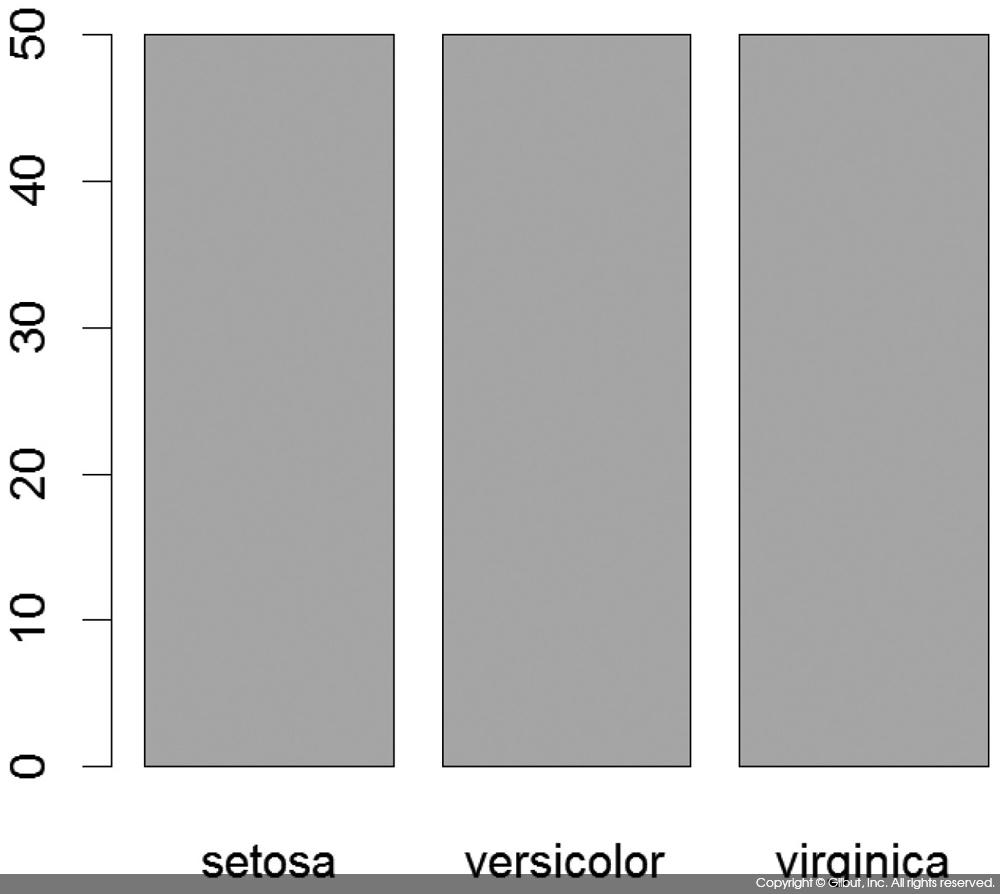
다음은 아이리스 데이터를 plot( )해본 예다.
> plot(iris)
> plot(iris$Sepal.Length)
> plot(iris$Species)
위 코드의 실행 결과를 그림 9-1 ~ 그림 9-3에 각각 보였다.