2.7.3 Button 컴포넌트 사용하기
다음으로 Button 컴포넌트를 불러와서 Box 컴포넌트 상단에 보여주겠습니다. Button 컴포넌트의 이름은 title Props를 통해 설정할 수 있습니다.
추가로 onPress라는 함수를 선언해 이 함수에서 setVisible 함수를 호출해 기존 visible 값을 반전시키겠습니다. 즉, 기존 값이 false라면 true로 바꾸고, true라면 false로 바꾸는 작업을 구현하겠습니다. onPress 함수를 구현한 다음에 Button의 onPress Props로 지정하면 버튼을 눌렀을 때 해당 함수가 호출됩니다.
App.js
import React, {useState} from 'react';
import {SafeAreaView, Button} from 'react-native';
import Box from './components/Box';
const () => {
const [visible, setVisible] (true);
const onPress = () => {
setVisible(!visible);
};
return (
<SafeAreaView>
<Button title="토글" onPress={onPress} />
<Box rounded={true} size="large" color="blue" />
</SafeAreaView>
);
};
export default App;
버튼이 잘 나타났나요? (안드로이드에서는 버튼 색상이 다릅니다.)
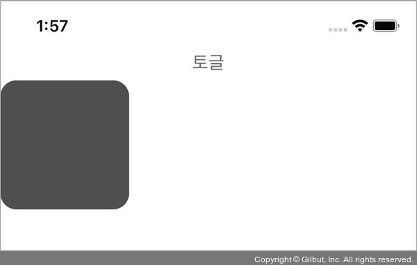
▲ 그림 2-12 Button 컴포넌트