그리고 Tab.Screen의 options Props에는 다음과 같은 값을 설정할 수 있습니다.
• tabBarIcon: 아이콘을 보여주는 함수, { focused: boolean, color: string } 타입의 파라미터를 받아옵니다.
• tabBarLabel: 탭에 보이는 이름
• tabBarBadge: 탭 아이콘에 배지를 보여줍니다. 이 값을 true로 설정하면 아이콘 우측 상단에 빨간색 점을 보여줍니다. 이 값을 문자열 또는 숫자로 입력하면 그 내용이 배지에 나타납니다.
다음과 같이 코드를 변경해 탭 아이콘에 배지를 설정해보세요.
screens/MainScreen.js
<Tab.Screen name="Home" component={HomeScreen} options={{ tabBarLabel: '홈', ({color}) => <Icon name="home" color={color} size={24} />, tabBarColor: 'black', tabBarBadge: 'new', }} /> <Tab.Screen name="Search" component={SearchScreen} options={{ tabBarLabel: '검색', ({color}) => ( <Icon name="search" color={color} size={24} /> ), tabBarColor: 'gray', }} /> <Tab.Screen name="Notification" component={NotificationScreen} options={{ tabBarLabel: '알림', ({color}) => ( <Icon name="notifications" color={color} size={24} /> ), tabBarColor: 'green', tabBarBadge: 30, }} /> <Tab.Screen name="Message" component={MessageScreen} options={{ tabBarLabel: '메시지', ({color}) => ( <Icon name="message" color={color} size={24} /> ), tabBarColor: 'blue', tabBarBadge: true, }} />
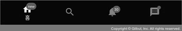
▲ 그림 5-27 tabBarBadge