Note ≡
역주 사이킷런 0.22 버전에서 plot_roc_curve() 함수와 plot_precision_recall_curve() 함수를 사용하면 ROC 곡선과 정밀도-재현율 곡선을 쉽게 그릴 수 있습니다.
plot_roc_curve() 함수에 모델과 테스트 데이터를 전달하면 RocCurveDisplay 객체를 반환합니다. 이 객체에는 FPR과 TPR 값이 저장되어 있어 평균을 구할 때 활용할 수 있습니다. 다음은 앞에서처럼 교차 검증의 ROC 곡선을 그리는 코드입니다.
>>> from sklearn.metrics import plot_roc_curve
>>> fig, ax = plt.subplots(figsize=(7, 5))
>>> mean_tpr = 0.0
>>> mean_fpr = np.linspace(0, 1, 100)
>>> for i, (train, test) in enumerate(cv):
...     pipe_lr.fit(X_train2[train], y_train[train])
...     roc_disp = plot_roc_curve(pipe_lr,
...                               X_train2[test], y_train[test],
...                               name=f'Fold {i}', ax=ax)
...     mean_tpr += interp(mean_fpr, roc_disp.fpr, roc_disp.tpr)
...     mean_tpr[0] = 0.0
>>> plt.plot([0, 1], [0, 1],
...          linestyle='--', color=(0.6, 0.6, 0.6),
...          label='Random guessing')
>>> mean_tpr /= len(cv)
>>> mean_tpr[-1] = 1.0
>>> mean_auc = auc(mean_fpr, mean_tpr)
>>> plt.plot(mean_fpr, mean_tpr, 'k--',
...          label='Mean ROC (area = %0.2f)' % mean_auc, lw=2)
>>> plt.plot([0, 0, 1], [0, 1, 1],
...          linestyle=':', color='black',
...          label='Perfect performance')
>>> plt.xlim([-0.05, 1.05])
>>> plt.ylim([-0.05, 1.05])
>>> plt.xlabel('False positive rate')
>>> plt.ylabel('True positive rate')
>>> plt.legend(loc="lower right")
>>> plt.show()
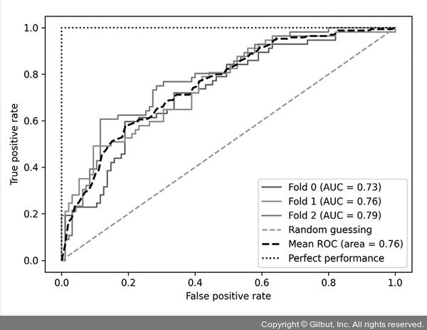
▲ 그림 6-14 plot_roc_curve( ) 함수로 그린 ROC 곡선
정밀도-재현율 곡선도 비슷한 방식으로 그릴 수 있습니다. plot_roc_curve() 함수를 plot_precision_recall_curve()로 바꿉니다. 이 함수가 반환하는 PrecisionRecallDisplay 객체에서 정밀도와 재현율을 추출하여 평균값을 계산할 때 사용합니다. 다만 재현율과 정밀도가 1에서부터 기록되기 때문에 두 배열을 뒤집어 정밀도 평균값을 계산합니다.
>>> from sklearn.metrics import plot_precision_recall_curve
>>> fig, ax = plt.subplots(figsize=(7, 5))
>>> mean_precision = 0.0
>>> mean_recall = np.linspace(0, 1, 100)
>>> for i, (train, test) in enumerate(cv):
...     pipe_lr.fit(X_train2[train], y_train[train])
...     pr_disp = plot_precision_recall_curve(
...         pipe_lr, X_train2[test], y_train[test],
...         name=f'Fold {i}', ax=ax)
...     mean_precision += interp(mean_recall,
...                              pr_disp.recall[::-1],
...                              pr_disp.precision[::-1])
>>> plt.plot([0, 1], [1, 0],
...          linestyle='--', color=(0.6, 0.6, 0.6),
...          label='Random guessing')
>>> mean_precision /= len(cv)
>>> mean_auc = auc(mean_recall, mean_precision)
>>> plt.plot(mean_recall, mean_precision, 'k--',
...          label='Mean ROC (area = %0.2f)' % mean_auc, lw=2)
>>> plt.plot([0, 1, 1], [1, 1, 0],
...          linestyle=':', color='black',
...          label='Perfect performance')
>>> plt.xlim([-0.05, 1.05])
>>> plt.ylim([-0.05, 1.05])
>>> plt.xlabel('Recall')
>>> plt.ylabel('Precision')
>>> plt.legend(loc="lower left")
>>> plt.show()
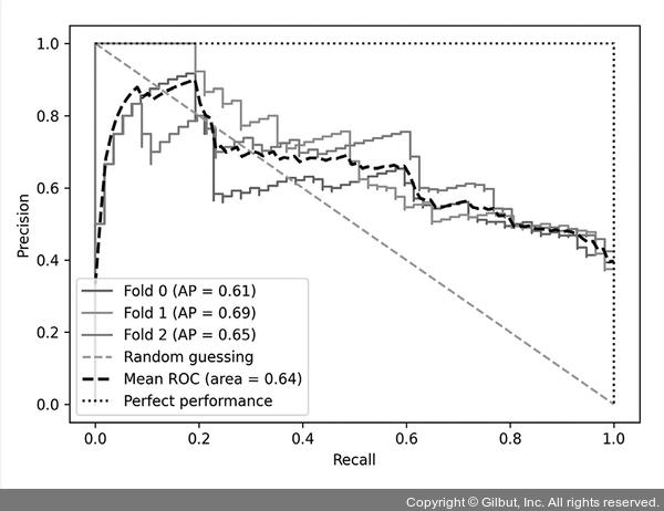
▲ 그림 6-15 plot_precision_recall_curve( ) 함수로 그린 정밀도-재현율 곡선