25.2.1.1 WriteActionButtons 만들기
WriteActionButtons 컴포넌트는 포스트 작성 및 취소를 할 수 있는 컴포넌트입니다. 이 컴포넌트에 두 개의 버튼을 만들고 onPublish, onCancel이라는 props를 받아 와서 사용하도록 해 보겠습니다.
components/write/WriteActionButtons.js
import React from 'react';
import styled from 'styled-components';
import Button from '../common/Button';

const WriteActionButtonsBlock = styled.div`
  margin-top: 1rem;
  margin-bottom: 3rem;
  button + button {
    margin-left: 0.5rem;
  }
`;

/* TagBox에서 사용하는 버튼과 일치하는 높이로 설정한 후 서로 간의 여백 지정 */
const StyledButton = styled(Button)`
  height: 2.125rem;
  & + & {
    margin-left: 0.5rem;
  }
`;

const WriteActionButtons = ({ onCancel, onPublish }) => {
  return (
    <WriteActionButtonsBlock>
      <StyledButton cyan onClick={onPublish}>
        포스트 등록
      </StyledButton>
      <StyledButton onClick={onCancel}>취소</StyledButton>
    </WriteActionButtonsBlock>
  );
};

export default WriteActionButtons;
컴포넌트를 다 만든 뒤에는 WritePage에서 렌더링하세요.
pages/WritePage.js
import React from 'react';
import Editor from '../components/write/Editor';
import TagBox from '../components/write/TagBox';
import WriteActionButtons from '../components/write/WriteActionButtons';
import Responsive from '../components/common/Responsive';

const WritePage = () => {
  return (
    <Responsive>
      <Editor />
      <TagBox />
      <WriteActionButtons />
    </Responsive>
  );
};

export default WritePage;
글쓰기 페이지에 필요한 모든 컴포넌트의 UI를 완성했습니다! 이제 화면에 다음과 같은 결과가 나타날 것입니다.
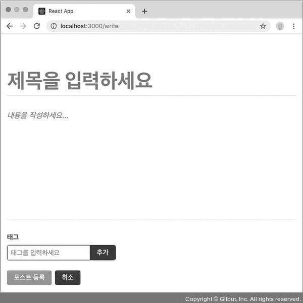
▲ 그림 25-5 WritePage UI 구성 완료